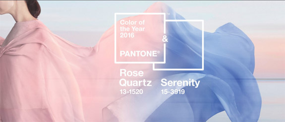
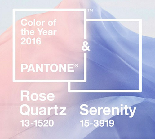
For the first time ever, the color experts at Pantone have blended two shades — Rose Quartz and Serenity Blue — to create its 2016 Color of the Year. Together, the mineral pink and tranquil blue combine to communicate a sense of wellness and peacefulness, with a dash of gender equality.
Noted Pantone, "Rose Quartz is a persuasive yet gentle tone that conveys compassion and a sense of composure. Serenity is weightless and airy, like the expanse of the blue sky above us, bringing feelings of respite and relaxation even in turbulent times."
On its website, Pantone is displaying a short video showing the two colors flowing seamlessly into each other. This transition back and forth from pink to blue represents “societal movements toward gender equality and fluidity," according to Leatrice Eiseman, executive director of the Pantone Color Institute.
Each year, the color authorities at Pantone pick a color that they believe will be popular for designs and products in the coming year. Typically, Pantone’s annual selection shows up in fashion, beauty, housewares, home and industrial design and consumer packaging.
A year ago, Pantone disappointed the masses with its choice of Marsala, a brownish-red hue resembling high school cafeteria mystery meat.
This year's colors — which are formally designated as PANTONE 13-1520 and PANTONE 15-3919 — were greeted with enthusiasm by a leading jewelry-industry publication.
"The shades, Rose Quartz (yay! My pick!) and Serenity Blue, are ideal for the jewelry industry," wrote Brittany Siminitz of JCK. "The blue reads as a chalcedony to me, touched with an almost purplish hue, while the pink, like its name, resembles rose quartz."
A New York Times columnist offered a more tepid review...
"Admittedly, choosing the most clichéd gender colors can seem a bit simplistic," wrote Vanessa Friedman in the Times, "but Pantone has a broad constituency to manage; this is not about the cutting edge, but the big middle."

Here’s a list of the previous Pantone Colors of the Year…
PANTONE 18-1438 Marsala (2015)
PANTONE 18-3224 Radiant Orchid (2014)
PANTONE 17-5641 Emerald (2013)
PANTONE 17-1463 Tangerine Tango (2012)
PANTONE 18-2120 Honeysuckle (2011)
PANTONE 15-5519 Turquoise (2010)
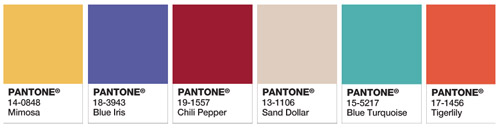
PANTONE 14-0848 Mimosa (2009)
PANTONE 18-3943 Blue Iris (2008)
PANTONE 19-1557 Chili Pepper (2007)
PANTONE 13-1106 Sand Dollar (2006)
PANTONE 15-5217 Blue Turquoise (2005)
PANTONE 17-1456 Tigerlily (2004)
Images via Pantone.com.
No comments:
Post a Comment